PERSONAL BRAND ECOSYSTEM
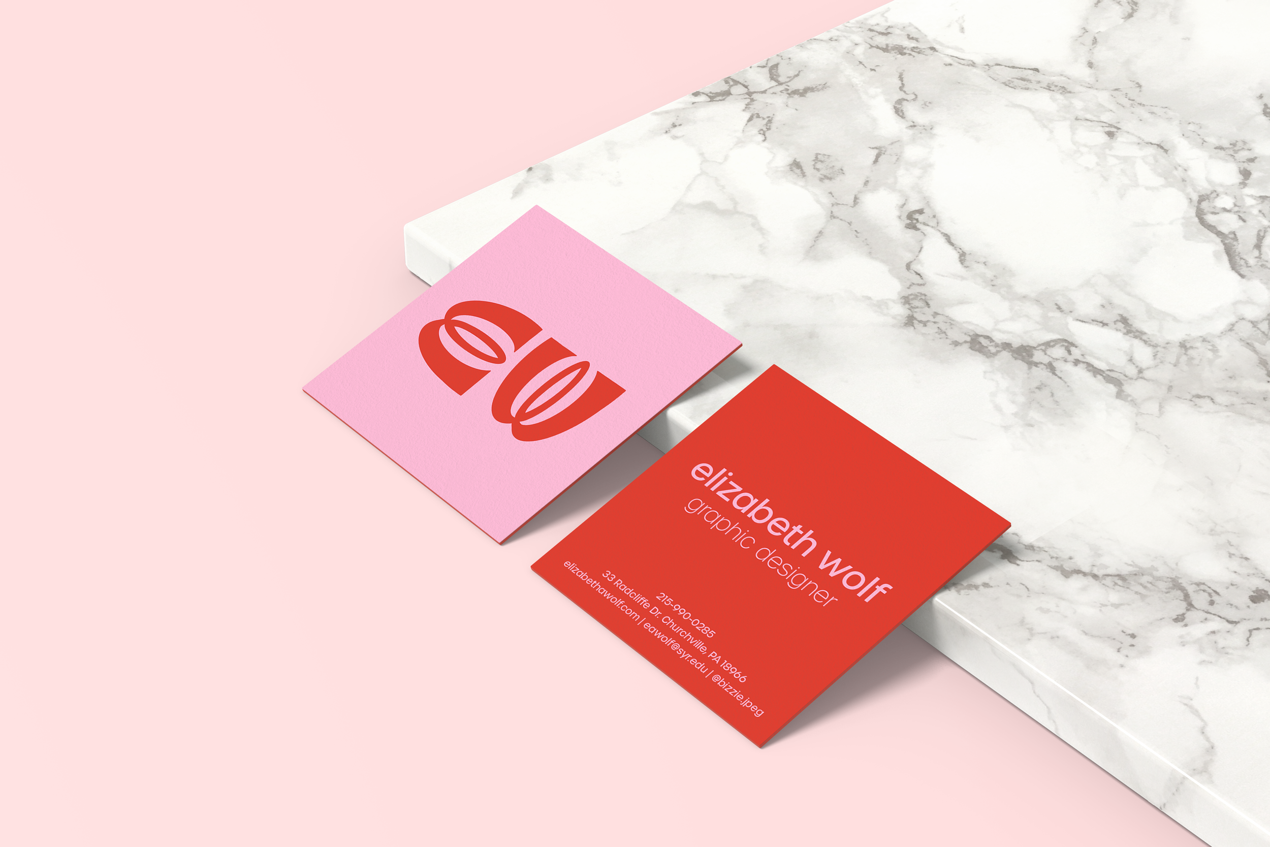
I have hated my initials ever since I could read and realized that they spelled the exclamation people make when they are disgusted. It was challenging to create a wordmark for myself without making the brain think “EW!” The easy solution to this issue was to use my middle initial, but I rarely use my middle name and I felt it wasn’t fitting to my brand.
So, I continued to add inspiration to my brand identity Pinterest board and became increasingly jealous of people with cooler initials. I was inspired by experimental type and hand-lettering but still creatively stuck. Randomly, while signing a receipt, I realized my cursive E and W were the same shape, rotated 90 degrees.
I changed my logo to a glyph that mimics script E and W (rounded shoulders, loopy center arm(s) and an open counter) from the handwritten cursive that inspired me, but has pointy edges, thick arms, and straight terminals to give it a more clean, modern, geometric look. I used the principle of symmetry by rotating the glyph to make an “E W”.
For my brand colors, I chose bright red (R=222 G=34 B=18), medium pink (R=255 G=177 B=211), and white as a supplemental color. I chose red because it is attention-grabbing, stimulating, and bold. Red also represents passion, energy, confidence, power, and strength. I chose pink because it is warm, friendly, approachable, playful, and feminine. Pink and red complement each other because they are “cousin colors”; The pink serves to soften the intensity of the red.
OBJECTIVE: Create a personal brand identity, logo, and stationery system.
ROLES: ideation, designer, client
TOOLS: Adobe Illustrator, Adobe InDesign, Adobe Photoshop